Nebula UI is an open source styling component cibrary, which helps Developers to use best styles and components, by using pre-defined classnames. Nebula helps you to quickly build your Dream Project.
Installation Guide
In order to introduce Nebula ui to your project, Copy the Link given below and paste it in the head tag of your html, above all other style sheets.
Text Utilities
Documentation and examples for common text utilities to control
alignment, weight, and more.
Headings
All HTML headings, h1 through h6, are available.
H1 - Heading 1
H2 - Heading 2
H3 - Heading 3
H4 - Heading 4
H5 - Heading 5
H6 - Heading 6
Alignment
Use classes text-left ,text-center or
text-right to center, left or right align text.
Left align
Center-align
Right Align
Font Sizes
Use fs-1, fs-2, fs-3,
fs-4, fs-5 and
fs-6 to change the font size.
Font size 6
Font size 5
Font size 4
Font size 3
Font size 2
Font size 1
Font Weight
Use fw-900, fw-700,
fw-600, fw-400 and
fw-300 to change the font weight.
Font Weight 900
Font Weight 700
Font Weight 600
Font Weight 400
Font Weight 300
Text Styles
To add strike-through on text, use text-strike class
To add a line under a text, use text-underline class
To add different text colors, use one of the classes
primary-color, secondary-color,
error-color, warning-color or
success-color.
This text is of Primary Color
This text is of gray Color
This text is of Error Color
This text is of Warning Color
This text is of Success Color
This text has a line going through it.
This text has a line underneath it.
Alert
An alert displays a short, important message in a way that attracts
the user's attention without interrupting the user's task.
Different alerts
The alert can be created by using giving class name of different
alert variants.
This is an error alert — check it out!
This is a warning alert — check it out!
This is an info alert — check it out!
This is a success alert — check it out!
Avatar
Avatars are user profile pictures, usually found in circular shapes.
It can be used to show user's profile picture on profile information
page, on navigation bar, in blogs grid items.
Profile Avatar
You can use Profile Avatars by add 'avatar' class inside the img
tag.
Avatar in different sizes
Size of the avatars can be changed by adding avatar-large |
avatar-meduim | avatar-small class to the existing avatar class.
Buttons
Buttons are also called as call to action which is important part in
website. Buttons allow users to take actions, and make choices, with
a single tap.
Contained Buttons
Contained buttons contain actions that are primary to your app.
Contained buttons are high-emphasis, distinguished by their use.
They contain actions that are primary to your app.
Outlined Buttons
The outline button style removes all background colors from a button
and gives it a lighter look. The outline style buttons can be used
for various purposes.
for example: Indicating the secondary action complementing the
primary action.
Link Buttons
When mouse clicked on the button then the button acts like a link
and redirect page into the given location. This is used to show a
button which will work as link.
Buttons With Icon
Icons in buttons represents the specific action related to that
icon. Icon buttons allow users to take actions, and make choices,
with a single tap.
Floating Action buttons
A floating action button (FAB) performs the primary, or most common,
action on a screen. It appears in front of all screen content,
typically as a circular shape with an icon in its center.
Buttons in sizes
You can make button large and small by putting class
btn-small and btn-large.
Badge
Badges are being used to display a notification count or status
information. Badge can be used to display numbers, online / offline
status, depending on where they are used.
Profile Badge
The profile badge used to show current status of a user. status can
be online, offline or DND. You can use this status by add class
status-online, status-away and status-dnd.
Badge on icon
Badge on icon is used to show the no. of items present in the which
icon represents. You can put icon based on what you want to
represent with that icon.
2
2
Card
Cards are surfaces that display content and actions on a single
topic. They should be easy to scan for relevant and actionable
information. Card are used to show user related data collectively,
like product details.
Text Card
Text card is basically have heading and discription which is used to
show some information.
Currently unavailable
New×
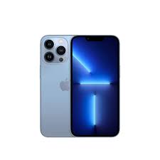
iPhone 13 Pro
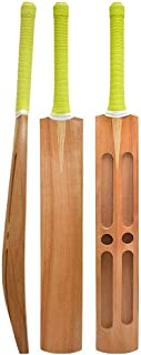
Cricket Shoes for Mens - Lightweight, maximized Grip &
Quick Actions
Rs.
1,19,9001,19,90010%
Heading
Lorem ipsum dolor sit amet consectetur adipisicing elit. At,
earum nobis aspernatur quibusdam quisquam sunt repudiandae non
mollitia vel sint.
Horizontal Card
A card in which contents are placed in horizontal direction.
Currently unavailable
New×
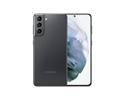
Samsung Galaxy S21 5G
(Phantom Violet, 8GB, 128GB Storage) with No Cost
EMI/Additional Exchange Offers
Rs.
59,990Rs.83,99929%
Heading
Lorem ipsum dolor sit amet consectetur adipisicing elit. At,
earum nobis aspernatur quibusdam quisquam sunt repudiandae non
mollitia vel sint.
Vertical Card
A card in which contents are placed in horizontal direction.
Currently unavailable
New×
iPhone 13 Pro
Sierra Blue
Rs.
1,19,900Rs.1,20,90010%
Heading
Lorem ipsum dolor sit amet consectetur adipisicing elit. At,
earum nobis aspernatur quibusdam quisquam sunt repudiandae non
mollitia vel sint.
Card with badge
A card have badge on it which describes status of product e.g. new,
best value etc.
Currently unavailable
New
iPhone 13 Pro
Sierra Blue
Rs.
1,19,900Rs.1,20,90010%
Heading
Lorem ipsum dolor sit amet consectetur adipisicing elit. At,
earum nobis aspernatur quibusdam quisquam sunt repudiandae non
mollitia vel sint.
Card with dismiss
A card have dismiss button on it so we can cancle that card.
Currently unavailable
New×
iPhone 13 Pro
Sierra Blue
Rs.
1,19,9001,20,90010%
Heading
Lorem ipsum dolor sit amet consectetur adipisicing elit. At,
earum nobis aspernatur quibusdam quisquam sunt repudiandae non
mollitia vel sint.
Text overlay Card
A card have text overlay on it to show status of availibility of
product.
Currently unavailable
New×
iPhone 13 Pro
Sierra Blue
Rs.
1,19,9001,20,90010%
Heading
Lorem ipsum dolor sit amet consectetur adipisicing elit. At,
earum nobis aspernatur quibusdam quisquam sunt repudiandae non
mollitia vel sint.
Card with shadow
A card have shadow effect around it.
Currently unavailable
New×
iPhone 13 Pro
Sierra Blue
Rs.
1,19,9001,20,90010%
Heading
Lorem ipsum dolor sit amet consectetur adipisicing elit. At,
earum nobis aspernatur quibusdam quisquam sunt repudiandae non
mollitia vel sint.
Image
Images can be responsive to fit the parent's width, and also can be
customised to be round shaped
Responsive Image
Responsive Image Components are used to dsiplay Images on websites,
which are screen responsive. They expand upto the width of the
container they are in. You can make image responsive just by putting
class name img-responsive in image.
Rounded corner Image
You can make rounded corner image by putting class name
rounded-corner-img in image.
Round Image
You can make your image round by add class
round-img in image.
Input
Inputs are necessary for user interaction with the website. Inputs
are used to take information from the user, and then save the data
to the server, accordingly.
Simple Input
Simple Input has a label present at the top of the input field.
Error Input
Error input can be used to show error message and change the color
accordingly.
Wrong Password. Try again.
Success Input
Success input can be used to show success message and change the
color accordingly.
This is success message
Rating
Rating is used for taking reviews from users and show review on
products in a website.
Number Rating
Number rating shows rating or review counts of products.
4.2(2,515)
Read only Rating
You can show ratings as stars. use class
rat-active to make perticular star colorized.
(2,515)
List
Lists can be used at so many places, navigation bar, stacked
notifications, article pages, etc.
Unordered list
You can add list-style-square and
list-style-circle to make bullets sqaure and circle
in list.
list item1
list item2
list item3
list item1
list item2
list item3
list item1
list item2
list item3
Ordered list
Add class according to bullets. You can add
li-lower_roman, li-upper_roman, li-upper_alpha and
li-lower_alpha
accordingly.
List item with numbers
List item with numbers
List item with numbers
List item with lower roamn
List item with lower roamn
List item with lower roamn
List item with upper roamn
List item with upper roamn
List item with upper roamn
List item with upper alphabet
List item with upper alphabet
List item with upper alphabet
List item with upper alphabet
List item with upper alphabet
List item with upper alphabet
Stacked List
We can use stacked list in notifications.
Notification 1
Notification 2
Notification 3
Notification 4
Select List Groups
Select List groups contains items with checkboxes. They are useful
for refining the products search on an eCommerce website.
Navigation
A navigation bar allows you the opportunity to prioritise the content you want visitors to read.
Standard
This is standard navigation bar where you can se hamburger menu and some action icons.
San Francisco
Only Heading
This navigation menu have only heading and hamburger menu option.
San Francisco
Prominent
This navbar have prominent heading with some margin in top.
San Francisco
Prominent And Dence
This navbar have prominent heading with some small margin in top.
San Francisco
Navbar with input
This navbar have input element for searching purpose.
San Francisco
Modal
Use modal to add dialogs to your site for lightboxes, user notifications, or completely custom content.
Modal Title
×
Modal body text goes here.
Toast
The toast displays an unobtrusive and non-block popup box to send informational messages to your web users.
Successfully logged in
×
Oops! password is too weak
×
Sorry! Email is not registered yet
×
Grid
CSS Grid Layout excels at dividing a page into major regions or devide perticular boxes into columns and rows.
Grid 2 items
Grid can be used to devide total width into evenly two parts.
Currently unavailable
New×
iPhone 13 Pro
Sierra Blue
Rs.
1,19,9001,20,90010%
Heading
Lorem ipsum dolor sit amet consectetur adipisicing elit. At, earum
nobis aspernatur quibusdam quisquam sunt repudiandae non mollitia
vel sint.
Currently unavailable
New×
iPhone 13 Pro
Sierra Blue
Rs.
1,19,9001,20,90010%
Heading
Lorem ipsum dolor sit amet consectetur adipisicing elit. At, earum
nobis aspernatur quibusdam quisquam sunt repudiandae non mollitia
vel sint.
Grid 3 items
Grid can be used to devide total width into evenly three parts.
Currently unavailable
New×
iPhone 13 Pro
Sierra Blue
Rs.
1,19,9001,20,90010%
Heading
Lorem ipsum dolor sit amet consectetur adipisicing elit. At, earum
nobis aspernatur quibusdam quisquam sunt repudiandae non mollitia
vel sint.
Currently unavailable
New×
iPhone 13 Pro
Sierra Blue
Rs.
1,19,9001,20,90010%
Heading
Lorem ipsum dolor sit amet consectetur adipisicing elit. At, earum
nobis aspernatur quibusdam quisquam sunt repudiandae non mollitia
vel sint.
Currently unavailable
New×
iPhone 13 Pro
Sierra Blue
Rs.
1,19,9001,20,90010%
Heading
Lorem ipsum dolor sit amet consectetur adipisicing elit. At, earum
nobis aspernatur quibusdam quisquam sunt repudiandae non mollitia
vel sint.

